What? A blog post on how to take a screenshot? Seriously? Sure, this might seem a silly or superfluous blog post, but I can assure you that I see lousy screenshots on blogs, online tutorials and more (including some of my old posts) at least daily. Perhaps it's my "geek eye" but I (and I assume you, Dear Reader) just know when something is wrong with a screenshot. Just like you are the only one who notices when someone is running a 4:3 image on a 16:9 flat screen at a convention and it looks darned unprofessional, the same is true with screenshots.
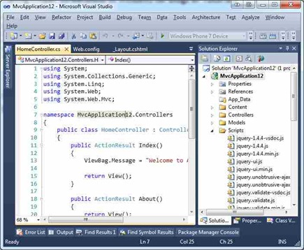

Try to avoid small resizes, like taking an image and resizing it to 95%. If you are that close, try reframing or resizing the thing you're shooting, rather than doing such a small resize.
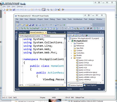
Then, you can crop around it and get a title bar that doesn't look like crap:

Two, use a proper screenshot tool like Window Clippings. More on this later, but it's truly a great tool and worth it if you are taking more than a few screenshots a week. It'll save you time and make you look good. Window Clippings does two things right around transparency. First, it'll programmatically and automatically put a background behind your image while its taking the screenshot, and second, it'll make your transparent regions actually transparent when it makes a PNG.
See this square corner? That's not transparent and looks subtly lame. This was taken with the Window Selection option in the Snipping Tool that came with Windows.

See this one taken with Window Clippings? It's correctly transparent as a PNG and there's even an option to include a nice drop shadow.

Next, the same shot with ClearType on.
Don't get me wrong, SnagIt is an awesome tool. But just don't point it at your face. Avoid callouts, and when you do, stay classy.
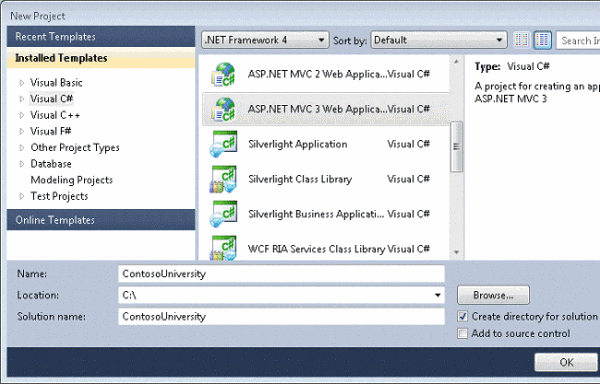
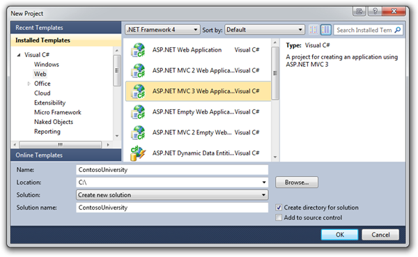
So, rolling all this advice up, here's a good screenshot and a bad one.
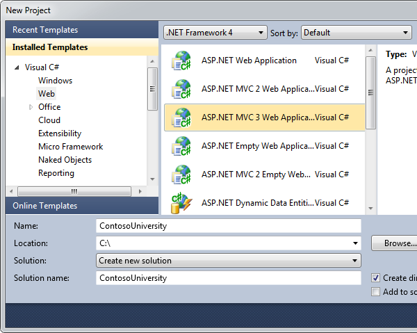
Or, given our self-imposed width limitation of 600 pixels, perhaps:
I hope this guide helps you, Dear Reader, if you create screenshots as a part of your job.
Please, care about your screenshots as much as you care about your text.
"A bad screenshot is equivalent to a misspelled world. It makes both you and the word look unprofessional." - Me, just now.Sometimes the best way to show you how to do something is to first talk about how not to do something.
Don't save Screenshots as JPEGs
JPEG is lossy. Lossy means "throws stuff away." Always save your screenshots as PNG, which is a lossless (throws nothing away) format.
Don't do uncomfortable, unnecessary or bad resizing
When resizing, only do it if you have to. Always use the highest quality resize algorithm your paint application supports. I use Paint.NET. It's one of the greatest pieces of software out there that should have shipped with Windows. Try to resize things "evenly," like 50% or 25%. If you resize to 73% or or 431 pixels by something, you are throwing data away and your screenshot will look bad.
Try to avoid small resizes, like taking an image and resizing it to 95%. If you are that close, try reframing or resizing the thing you're shooting, rather than doing such a small resize.
Don't customize your environment to the point it's unrecognizable
Think about Framing Your Screenshot as you would a photograph. I don't care about your toolbars. I don't care about your add-ins or your browser bookmarks. Turn EVERYTHING unnecessary off. That means toolbars, toolboxes, windows, add-ins, bookmark bars - anything that would make your screenshot look like your system and not mine. Keep everything stock and standard if you can.
Don't use tiny fonts and fancy colors.
As you can guess by now, these rules apply to screencasts as well. That means 16pt or better, folks. I use Consolas 16pt, minimum. 20 or 24 for Console Windows. Keep the default colors for your IDE. For Command Windows, use either White Text on a Blue Background or Green Text on a Black Background. Both have been proven to be the highest contrast and easiest to see (by me in totally scientific tests.)
Don't show me what's underneath your transparent Aero Title Bar
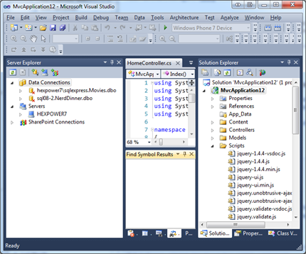
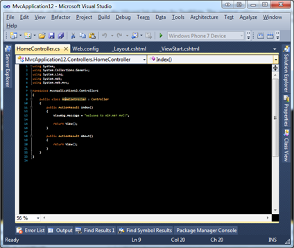
Notice how you can almost see stuff underneath the transparent title bars of these last few screenshots? That's lame. There's two ways to fix it. One, open up notepad with its white background and put it behind the application you are shooting so the white is what you see behind the transparency.
Then, you can crop around it and get a title bar that doesn't look like crap:

Two, use a proper screenshot tool like Window Clippings. More on this later, but it's truly a great tool and worth it if you are taking more than a few screenshots a week. It'll save you time and make you look good. Window Clippings does two things right around transparency. First, it'll programmatically and automatically put a background behind your image while its taking the screenshot, and second, it'll make your transparent regions actually transparent when it makes a PNG.
See this square corner? That's not transparent and looks subtly lame. This was taken with the Window Selection option in the Snipping Tool that came with Windows.

See this one taken with Window Clippings? It's correctly transparent as a PNG and there's even an option to include a nice drop shadow.

Don't use Basic or Classic Theme for Screenshots
Again, I don't know your personal preference, but it doesn't matter. Make your screenshots look like the typical computer, not your computer as you refuse to let Classic Theme go. ¡Viva NT4! Um, no.
Don't use Raster Fonts or Disable ClearType
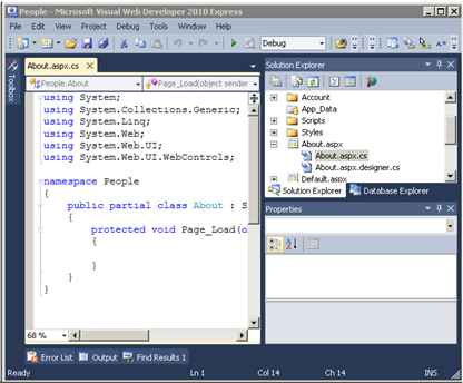
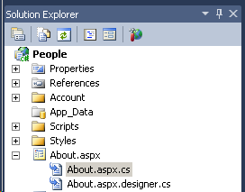
We're going for aesthetics and standardization, here. Consider these two screenshots. The first has ClearType off. Notice the blocky capital A, for example.
Next, the same shot with ClearType on.

Don't Over-Annotate or use wacky Callout Effects
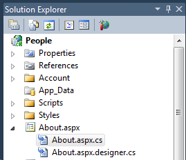
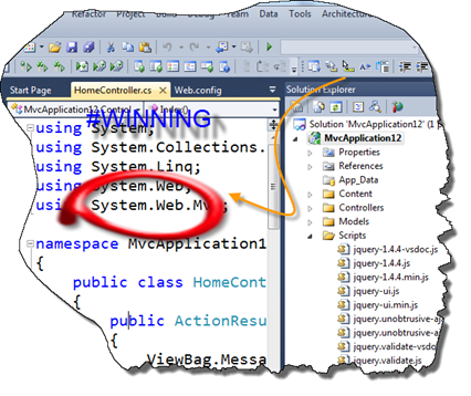
Another great screenshot program is SnagIt from TechSmith. I use their Camtasia product for all my screencasts. As great as SnagIt is, it has the powerful ability to create "callouts" easily. Too easily.
Don't get me wrong, SnagIt is an awesome tool. But just don't point it at your face. Avoid callouts, and when you do, stay classy.

Use ALT text
Try to use ALT text for all your screenshots. There's a blind person (or a hundred) reading your blog. Do them a favor and put in some nice descriptive ALT text on your screenshots. I like to leave them personal messages that you never see. It takes only a second, but it lives in your post forever and helps the visually impaired participate.Don't forget to squish your PNGs
PNG may be a lossless format but you can often still squeeze 5-30% of the size out of them with tools like PNGOut. This is a must-have tool in your path. I add PNGOut as a post-build step when I make tutorials and you can even hook up Window Clippings to run it for you after a screenshot. It is CPU intensive, but it's worth the effort when publishing your content. Go do it now, get all the PNGs from your blog, run PNGGauntlet on them (it'll take a while) and compare the directories. You'll save tens of megs if you're like me, and your readers will reap the benefits every time they visit your site.So, rolling all this advice up, here's a good screenshot and a bad one.
Bad Example
Here's a common example that completely bad. This screenshot is:- Using the Basic Theme
- It was likely taken on a Virtual Machine that didn't have Aero turned on.
- Not Transparent
- The window corners are curved, but there's a corner pixel.
- Oddly cropped to fit
- The right side is missing, but just a bit. Either chop a lot, or none. Don't chop a little.
- Poorly resized
- Note the trouble resizing the words "Installed Templates"
Notice the aspect ratio is ever-so-slightly wrong.
- Note the trouble resizing the words "Installed Templates"
- JPEG'ed
- Note the lossy artifacts under the selection in the listbox.
- Poorly Staged
- Note the highlight in the listbox is gray? That means the window didn't have focus when the screenshot was taken. It makes it hard to see the point of the screenshot.

Good Example

Or, given our self-imposed width limitation of 600 pixels, perhaps:

I hope this guide helps you, Dear Reader, if you create screenshots as a part of your job.
Please, care about your screenshots as much as you care about your text.
"If a picture is worth a thousand words, a crappy screenshot is a thousand misspelled words." - Me, Just now. Again.Enjoy!

0 Comments