
Introduction
A TreeView represents data in a hierarchical view in a parent child relationship where a parent node can be expanded or collapse. The left side bar of Windows Explorer is an example of a TreeView.
The TreeView tag represents a WPF TreeView control in XAML.
<TreeView>TreeView>
The Width and Height properties represent the width and the height of a TreeView. The Name property represents the name of the control, which is a unique identifier of a control. The Margin property tells the location of a TreeView on the parent control. The HorizontalAlignment and VerticalAlignment properties are used to set horizontal and vertical alignments.
The following code snippet sets the name, height, and width of a TreeView control. The code also sets horizontal alignment to left and vertical alignment to top.
<TreeView Margin="10,10,0,13" Name="TreeView1" HorizontalAlignment="Left"
VerticalAlignment="Top" Width="194" Height="200" />
Adding TreeView Items
A TreeView control hosts a collection of TreeViewItem. The Header property is the text of the item that is displayed on the view. The following code snippet adds a parent item and six child items to a TreeView control.
<TreeView Margin="10,10,0,13" Name="TreeView1" HorizontalAlignment="Left"
VerticalAlignment="Top" Width="194" Height="200">
<TreeViewItem Header="Cold Drinks">
<TreeViewItem Header="Coke">TreeViewItem>
<TreeViewItem Header="Pepsi">TreeViewItem>
<TreeViewItem Header="Orange Juice">TreeViewItem>
<TreeViewItem Header="Milk">TreeViewItem>
<TreeViewItem Header="Iced Tea">TreeViewItem>
<TreeViewItem Header="Mango Shake">TreeViewItem>
TreeViewItem>
TreeView>
By default, the parent node is collapsed but when you click on it, the expanded view looks like Figure 1.
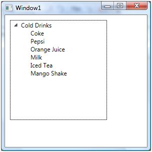
Figure 1. TreeView with items
Adding TreeView Items Dynamically
In previous section, we saw how to add items to a TreeView at design-time from XAML. We can add items to a TreeView from the code.
Let's change our UI and add a TextBox and a button control to the page. The XAML code for the TextBox and Button controls look like following:
<TextBox Height="23" HorizontalAlignment="Left" Margin="8,14,0,0"
Name="textBox1" VerticalAlignment="Top" Width="127" />
<Button Height="23" Margin="140,14,0,0" Name="button1" VerticalAlignment="Top"
HorizontalAlignment="Left" Width="76" Click="button1_Click">
Add Item
Button>
The final UI looks like Figure 2. On Add Item button click event handler, we are going to add a new item to the first parent node of the TreeView.
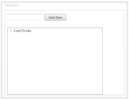
Figure 2.
On button click event handler, we add the content of TextBox to the TreeViewItem by calling TreeViewItem.Items.Add method. The following code adds TextBox contents to the TreeViewItem items.
private void button1_Click(object sender, RoutedEventArgs e)
{
TreeViewItem newChild = new TreeViewItem();
newChild.Header = textBox1.Text;
Parent.Items.Add(newChild);
}
On button click event handler, we add the content of TextBox to the TreeView by calling TreeViewItem.Items.Add method.
Now if you enter text in the TextBox and click Add Item button, it will add contents of the TextBox to the TreeView.
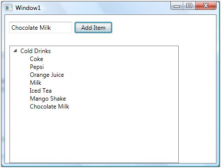
Figure 3. Adding TreeView items dynamically
Deleting TreeView Items
We can use TreeView.Items.Remove or TreeView.Items.RemoveAt method to delete an item from the collection of items in the TreeView. The RemoveAt method takes the index of the item in the collection.
Now, we modify our application and add a new button called Delete Item. The XAML code for this button looks like below.
<Button Height="23" Margin="226,14,124,0" Name="DeleteButton"
VerticalAlignment="Top" Click="DeleteButton_Click">
Delete ItemButton>
The button click event handler looks like following. On this button click, we find the index of the selected item and call TreeView.Items.RemoveAt method as following.
private void DeleteButton_Click(object sender, RoutedEventArgs e)
{
TreeView1.Items.RemoveAt
(TreeView1.Items.IndexOf(TreeView1.SelectedItem));
}
The above code removes root items from the TreeView, not the subitems. To remove sub items, first we need to find the selected item and then we need to call TreeViewItem.Items.RemoveAt method.
Styling a TreeView Items
A TreeView control is placed inside a StackPanel that contains a ScrollVewer control so when the width of height of the panel is more than the visible area, the scroll viewer gets active and provides horizontal and vertical scrolling functionality.
To style a TreeView, we can use individual TreeViewItems and set their properties. Alternatively, we can use System.Resources and set Style property. The following code snippet sets TreeViewItem foreground, font size, and font weight properties.
<Window.Resources>
<Style TargetType="{x:Type TreeViewItem}">
<Setter Property="Foreground" Value="Blue"/>
<Setter Property="FontSize" Value="12"/>
<Setter Property="FontWeight" Value="Bold" />
Style>
Window.Resources>
The new TreeView looks like Figure 4.
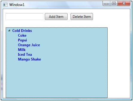
Figure 4. Formatted TreeView
Displaying Images in a TreeView
We can put any controls inside a TreeViewItem such as an image and text. To display an image side by side some text, I simply put an Image and TextBlock control within a StackPanel. The Image.Source property takes the name of the image you would like to display in the Image control and TextBlock.Text property takes a string that you would like to display in the TextBlock.
The following code snippet adds an image and text to a TreeViewItem. The key here is to add image and text to the header of TreeViewItems.
<TreeViewItem Name="Child1">
<TreeViewItem.Header>
<StackPanel Orientation="Horizontal">
<Image Source="coffie.jpg" Height="30">Image>
<TextBlock Text="Coffie">TextBlock>
StackPanel>
TreeViewItem.Header>
TreeViewItem>
After changing my code for all 5 TreeViewItems, the TreeView looks like Figure 5.
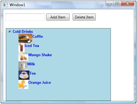
Figure 5. TreeViewItems with Image and text
TreeView with CheckBoxes
If you put a CheckBox control inside TreeViewItems, you generate a TreeView control with checkboxes in it. The CheckBox can host controls within it as well. For instance, we can put an image and text block as content of a CheckBox.
The following code snippet adds a CheckBox with an image and text to a TreeViewItem.
<TreeViewItem Name="Child1">
<TreeViewItem.Header>
<CheckBox Name="CoffieCheckBox">
<StackPanel Orientation="Horizontal">
<Image Source="coffie.jpg" Height="30">Image>
<TextBlock Text="Coffie">TextBlock>
StackPanel>
CheckBox>
TreeViewItem.Header>
TreeViewItem>
I change the code of TreeViewItems and add following CheckBoxes to the items. As you may see, I have set the name of the CheckBoxes using Name property. If you need to access these CheckBoxes, you may access them in the code using their Name property.
<TreeViewItem Name="Child1">
<TreeViewItem.Header>
<CheckBox Name="CoffieCheckBox">
<StackPanel Orientation="Horizontal">
<Image Source="coffie.jpg" Height="30">Image>
<TextBlock Text="Coffie">TextBlock>
StackPanel>
CheckBox>
TreeViewItem.Header>
TreeViewItem>
<TreeViewItem Name="Child2">
<TreeViewItem.Header>
<CheckBox Name="IcedTeaCheckBox">
<StackPanel Orientation="Horizontal">
<Image Source="IcedTea.jpg" Height="30">Image>
<TextBlock Text="Iced Tea">TextBlock>
StackPanel>
CheckBox>
TreeViewItem.Header>
TreeViewItem>
<TreeViewItem Name="Child3">
<TreeViewItem.Header>
<CheckBox Name="MangoShakeCheckBox">
<StackPanel Orientation="Horizontal">
<Image Source="MangoShake.jpg" Height="30">Image>
<TextBlock Text="Mango Shake">TextBlock>
StackPanel>
CheckBox>
TreeViewItem.Header>
TreeViewItem>
<TreeViewItem Name="Child4">
<TreeViewItem.Header>
<CheckBox Name="MilkCheckBox">
<StackPanel Orientation="Horizontal">
<Image Source="Milk.jpg" Height="30">Image>
<TextBlock Text="Milk">TextBlock>
StackPanel>
CheckBox>
TreeViewItem.Header>
TreeViewItem>
<TreeViewItem Name="Child5">
<TreeViewItem.Header>
<CheckBox Name="TeaCheckBox">
<StackPanel Orientation="Horizontal">
<Image Source="Tea.jpg" Height="30">Image>
<TextBlock Text="Tea">TextBlock>
StackPanel>
CheckBox>
TreeViewItem.Header>
TreeViewItem>
<TreeViewItem Name="Child6">
<TreeViewItem.Header>
<CheckBox Name="OrangeJuiceCheckBox">
<StackPanel Orientation="Horizontal">
<Image Source="OrangeJuice.jpg" Height="30">Image>
<TextBlock Text="Orange Juice">TextBlock>
StackPanel>
CheckBox>
TreeViewItem.Header>
TreeViewItem>
TreeViewItem>
Now, the new TreeView looks like Figure 6.
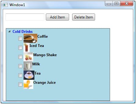
Figure 6. TreeView with CheckBoxes
Summary
This tutorial showed how to use a TreeView control in WPF and XAML. You also learned how to add check boxes and images to a TreeView items.
0 Comments